


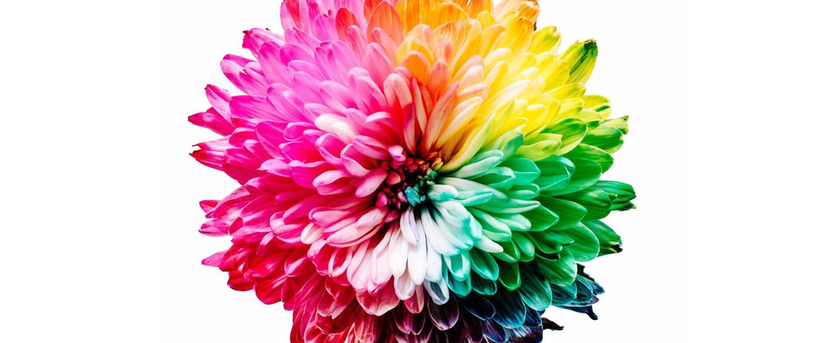
Color is one of the most important aspects of printing. It can make or break your message by letting your materials sing out to the audience or leaving them wanting more. Knowing how to use colors, when they’re most effective, and how to stir it all together to create marketing magic can be the difference-maker in your designs.
Humans have emotional reactions to colors. Communicating effectively relies on understanding that connection and using it to make sure you’re getting the right message across. Grab people’s attention! Get them excited! Use color in your design to make your viewers feel safe, somber, passionate, trusting, serene, or even hungry!
Using the Color Wheel in Your Design
The intro to color theory would not be complete without the color wheel. Colors are split into three main categories for design, with primary colors making the base. These three, red, yellow and blue, are the building blocks for the next tier, secondary colors. This group is made of green, orange and purple. Then you take your primary and secondary colors together, and you the recipe for the six tertiary colors. Once you’ve got all 12 colors, you can keep track of them by spinning them around in a wheel.
Take your colors for a spin!
The color wheel helps you pick and plan which colors to use in your design, based on their relation to their neighbors.
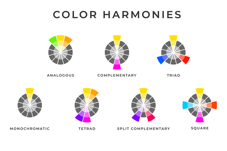
Colors can work well together, or they can clash. Finding good partnerships is more systematic than you may think, and using color in your design according to a few simple outlines in the color wheel can communicate your message with style:
- Monochromatic: You can find a whole world of variation in just one color. You can come up with a range of different options by adjusting the hue or saturation.
- Analogous: Using colors that are next to each other can leave people feeling a sense of calm. You’re staying in the color’s comfort zone by taking neighbors on either side.
- Complementary: You can find complementary colors by drawing a straight line across the wheel. Complimentary, in this case, means they have a high contrast, which can really make things stand out. This can be off-putting if over-used, but just the right amount can catch some attention.
- Split Complementary: You can also go with a split-complementary scheme, where you divide one end into two parts. This allows for a similarly strong contrast, but with a bit of relief with closely-associated colors to ease the setting.
- Triadic: Picking three evenly spaced colors around the wheel can give you a good variety of colors to make your base and accents while still keeping a well-rounded feel.
- Tetradic: You can add a fourth color with a rectangle, which allows for the largest range of combinations. You’ll have to pay attention to how they interact, but playing with both warm and cold colors can give you a rich diversity.
Mixing and matching the right colors can set your job apart, and the intro to color theory can be a good starting point. If you need help picking the right color combinations for your work, let Replica Digital Print & Copy help you bring your designs to life. Get started delivering the message you intended by requesting a quote today!
